
The logo
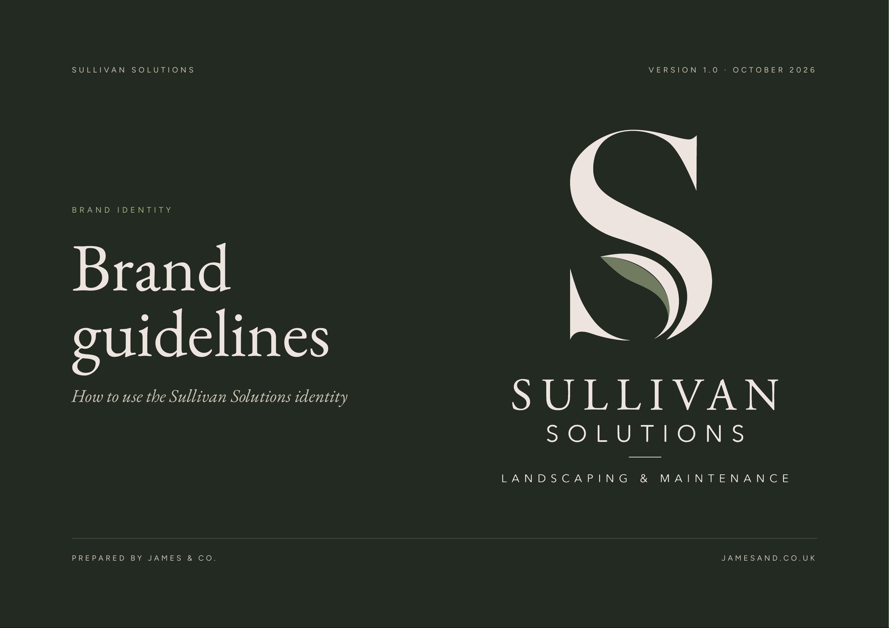
A classic serif S with a leaf growing inside it, and six versions so there's always one that fits, from a van side to a social media icon.







Case study · Sullivan Solutions
Sullivan Solutions is a landscaping and maintenance company. From a short brief on how they wanted the business to come across, I created a complete identity and the guidelines to use it, so it looks the same on every polo, van and post.
The challenge
Sullivan Solutions knew the impression they wanted to give, but not how to turn it into something that works everywhere. A brand has to hold up on an embroidered polo, a business card, a van side and a phone screen, and look the same whoever produces it.
What I did
Next, I'm helping with their website and van designs.
A classic serif S with a leaf growing inside it, and six versions so there's always one that fits, from a van side to a social media icon.
Forest, Stone and Sage, with print and screen values for each, and typefaces with free matches for the website.
A 21-page guide covering logo use, what to avoid, photography and tone of voice, written so printers, embroiderers and sign makers can follow it.
Business cards, polos, softshells, hoodies, caps, van livery, website direction and social media templates.
Every file organised by folder and named by version and colour, in AI, SVG, PDF and PNG, with a note on which file to send to whom.
The brand guidelines
In their words
From a brief explanation of the image/perception we wanted the business to portray, Holly got to work and far exceeded expectations. She was flexible throughout and never tried to pressure or rush an idea. The final artwork is fantastic and came to us very well presented.
Adam O'SullivanSullivan Solutions, Google review
Let's talk about where you're stretched and what would help.
Next case study
a private client